VIBA
Highmark Health
A multimedia experience centered around using digital and physical interactions to inform people on where to go for medical care.


Challenge
Unnecessary emergency room visits cause inefficiencies in cost and care for both patients and insurers.
People often go to the ER in a moment of panic because they have difficulty assessing the severity of the situation and assume they will get the best care there. Within the past year at Allegheny Health Network of Pittsburgh, 278,000 people went to the ER, of which 35% did not need to go.
My Role
Research Lead
Product Manager
UX Designer
Duration
8 months
Type
Game Design
Persuasive Design
Interactive Media
Team
Solution
Ann Peng
Shen Lu
Luca Damasco
Ravi Morbia
"Know Where to Go" is a multimedia experience centered around using digital and physical interactions to inform people on the most appropriate place to go for medical attention.
Our solution combines persuasive design principles, knowledge and skill components, and gamification techniques in order to prepare people to make the best decision on where to go during a medical incident.
The client
Highmark is a non-profit health insurer located in Pittsburgh. The Allegheny Health Network is a for-profit subsidiary of Highmark, and consists of 8 hospitals in the western Pennsylvania region.


prototype 1
Interaction Type
Question & Answer
Target Demographic
40 - 65 years old
Run Time
10 seconds
Conditional Trivia is a quick question and answer, that contextualizes itself based on how a user has already interacted with the site’s resources. Conditional trivia educates viewers by intermixing on and off topic content, while obfuscating it’s true purpose as a learning tool.


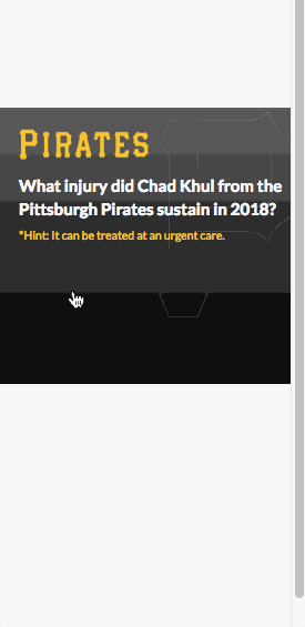
Conditional Trivia
Seasonal Wellness Prompt
Interactive Element
Interaction Type
Target Demographic
18 - 40 years old
Run Time
5 - 10 seconds
Seasonal Wellness prompts are short digital interactions that entice individuals to engage in preventive care measures. Our research showed that a fairly large percentage of inappropriate emergency room misuse comes from seasonal illness, such as the flu virus or lyme disease. By using seasonal wellness prompts, we can increase preparedness and reduce the negative implications of seasonal illnesses.


prototype 2
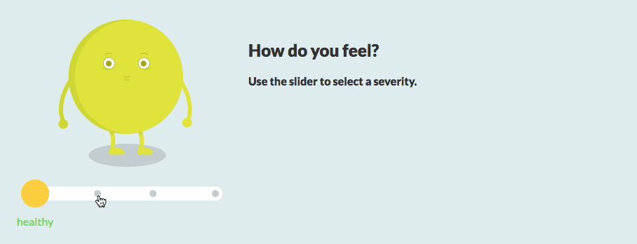
Slider
Slider is a contextualized interaction which changes based on the injuries a user is searching for. The interaction prompts users to note how severe “their” injury is, and then suggests a location that could treat that severity of injury.
Interaction Type
Question & Answer
Target Demographic
18 - 65 years old
Run Time
15 - 20 seconds
prototype 3

prototype 4
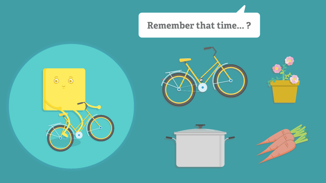
Remember that Time
Remember That Time is a short form interactive story which puts users in playful, but common, decision making scenarios. Remember that Time aims to drive traffic to online resources and teach severity assessment skills.
Interaction Type
Interactive Story
Target Demographic
18 - 30 years old
Run Time
30 seconds

prototype 5
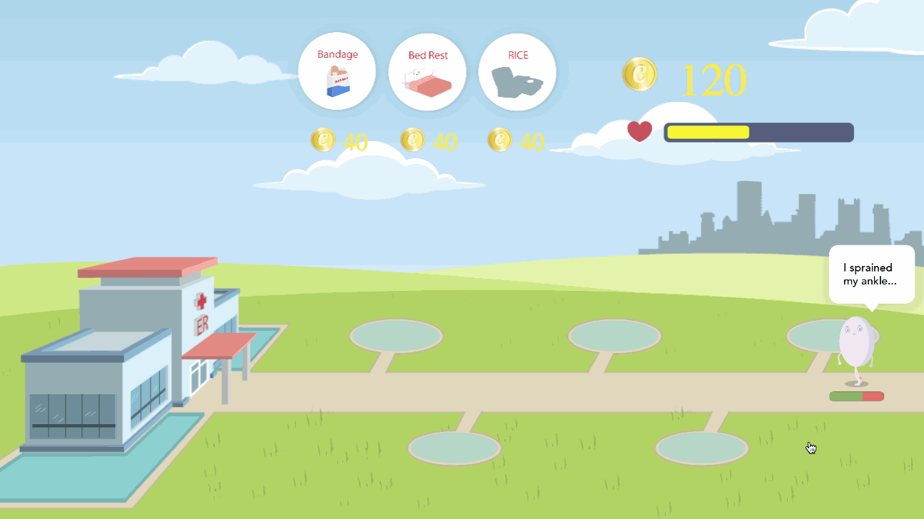
Defend the ER
Defend the ER is a longer digital experience that allows players to heal characters before they misuse an emergency room. In Defend the ER, players use self-care measures to heal characters. Players are eventually directed towards a reflection screen, where they are provided with information on the types of injuries and illnesses that can be treated at urgent care or home.
Interaction Type
Interactive Game
Target Demographic
18 - 30 years old
Run Time
1 - 3 minutes
prototype 6
Live GIF
Utilizing lenticular images, animations are converted into physical billboards and placed in areas where people move at a constant speed, like across from an escalator or moving pathway. These animations are intended to entice users to be intrigued by the novelty of the interaction to better absorb the knowledge components being delivered.
Interaction Type
Physical Ad
Target Demographic
18 - 65 years old
Run Time
15 - 20 seconds

prototype 7
The Sneeze augments a physical space by combining computer vision and digital projection to create an interactive advertisement. Participants are excited when the space is activated by a cue, like a loud sneeze, which causes the projection to turn on. Projections follow participants as they move around the space.
The Sneeze
Interaction Type
Interactive Projection
Target Demographic
.png)
18 - 65 years old
Run Time
30 secs - 3 mins
My role #1
Plan, conduct, and manage the research phase to define the problem space.
I divided the client's objectives into research areas, devised questions to explore each research area, and built a strategic plan defining research goals, timeline, and methodology.
My role #2
Lead communications with client, and present project findings and direction.
Each week, I updated the client on our progress, and presented new research discovery, wireframes, and prototypes. I articulated our strategy moving forward and ensured our work fit in line with the client's objectives.

My role #3
Conceive, prototype, and test game concepts.
I prototyped game concepts to explore and define objectives, rules, mechanics, outcomes, and characters.
I also conducted user testing sessions to get feedback and evaluate whether the player has learned the desired educational outcome.

Process
01
Research
02
Ideation
03
Design
Research Goals
1.
Learn about the American healthcare system.
Understand how people engage with their own healthcare.
2.
Analyze a person's decision making process at the time of a medical emergency.
Determine opportunities to intervene and successfully direct someone to the right site of care.
3.
4.
Research Methods
We used a vast number of research methods to explore the problem space. These explorations provided us with insights on behaviors, decision-making, and emotional states regarding urgent medical situations, and helped lay the foundation for our design.

Qualitative Interviews
45+ in-depth interviews with emergency room and urgent care visitors, emergency department nurses, administrators, and physicians

Field Observations
Direct observations of emergency departments, urgent cares, health and wellness centers, and doctor’s offices

Secondary Research
Review of research journals, medical advertising, patient engagement technologies, and existing data provided by our client

Competitive Analyses
Evaluate current way finding technologies, patient engagement apps, and other healthcare software for consumers

Affinity Diagramming
Aggregate and synthesize over 1,000 interview notes to identify issues and reveal valuable insights

Concept Mapping
Build concept maps to represent relationships and organize our knowledge of the healthcare space

Feature Analysis
Conduct analyses of our client’s current applications to evaluate features and find limitations

Patient Journey Map
Map out a patient journey flow to identify key interactions, motivations, and breakdowns

Co-Design Workshops
Facilitate 2 co-design workshops to understand the decision making process at the time of a medical incident

Personas
Design personas to create an understanding of our core users

Understanding the Patient Journey

By mapping out a patient's journey through an urgent medical situation, we identified seven areas we could intervene.


"I'm not sure how bad it is"
"I just want to go home"
"I've been to West Penn before so I'll go there again."
Early Research Findings
1.

People don’t know all the options for getting medical care.
"I usually just go to the ER"
2.
3.
4.


People go to the emergency room incorrectly when the situation is beyond their understanding.
Immediately after care, people are not in the mindset to receive new information.
People choose a care facility based on proximity, cost, familiarity, affiliation, and perceived quality of care.
Key research insights
1.
People’s preconceived notions about care, direct them on where to go when they need medical attention.
2.
It’s almost impossible to change a person’s decision after they’ve chosen a course of action during a medical emergency.
3.
There is a general lack of knowledge around key healthcare knowledge and skill concepts which lead to poor decision making.
Knowledge & Skill Components
Our research revealed several knowledge and skill components which we found were key to choosing the best fit location to treat a medical incident. Eventually, our solution would need to impart this knowledge on our users.
Knowledge Components
Proximity to Facilities
Types of Facilities
In-Network vs Out-of-Network
Facility Cost Differences
Skill Components
Assessing Condition Type
Assessing Severity Level
Conceptual design
We generated over 50 original ideas designed to entice users to engage with our educational content about the knowledge and skill components.

Utilizing the key insights, our generated knowledge and skill components, and our research on interactive advertising, we converted these ideas into several paper prototypes.

Early Prototype Concepts
Waiting in Line
Characters are waiting in line to go through the magical door to be healed. Each character has a countdown which indicates the level of severity. The player has to rank the characters so everyone is seen before exploding.
Driving Game
In a driving stimulation game, the player is presented with progressive symptoms and must decide where the character should go every time a new symptom pops up.

The Gift
The app presents a gift box on the interface, using the user’s geolocation, and suggesting the user open it. If the user clicks on the box, a short animation of pops up, informing them about the new micro-hospital within their community.


from ideas to prototypes
We evaluated each concept on several metrics.
Potential learning outcomes
What could a participant learn?
Novelty
Is this design novel and exciting?
Generalizability
Can we swap learning content?
Complexity
How difficult is it to understand?


Creating a Character Style
When creating our character style for our prototypes, we considered several different styles from realistic to playful. We explored color, shape, and size, as well as their ability to properly represent an injury. After testing our characters with participants, we landed on a playful cartoon style which allowed us to showcase injuries properly, while still distancing characters from looking too human, which would have elicited too much empathy from participants. We also used the wong-baker scale to create medically accurate facial expressions for our characters.


validating our prototypes
During our initial rounds of paper prototype testing, we aimed to determine if our general concepts would actually work.
Evaluate game metrics
Find ways to deepen our game mechanics so they keep players engaged.
Overall game feel
Determine if participants enjoyed the basic interactions in the game, and whether it enticed them to play more.
Could the player decipher a learning outcome?
Did our initial prototypes show promising results that high fidelity versions could teach our participants?
Testing interactive prototypes
We used 3 key metrics to determine if our high fidelity prototypes were successful.


Learn
To determine our prototypes were successful at teaching key knowledge and skill components, we administered pre, post, and follow-up tests. We aimed to get a base understanding on whether or not short term learning gain could occur after completing our modules. After interacting with our prototypes, 45% of participants believed they could save more money than they previously thought, by going to an urgent care instead of an emergency room.
Enjoy
A key component of our prototypes were that they obfuscated their true intentions as educational tools. We wanted to make sure that our prototypes were generally enjoyable and that participants considered them genuinely interesting. While testing, several participants mentioned that they would “hit replay” every time, showing us that our games had genuine interest and replayability for our core audiences.

Interact
Lastly, we wanted to validate that our participants would interact with our modules in context without being prompted to do so. We set up several sessions where participants were presented with a simulated web page and asked to complete a general task on the site. We then watched to see if they would click and play through our modules. When testing our final iteration of the Flu Monster, 5/5 participants interacted with our seasonal wellness prompt, on their own.